Tractive A+ Content
I redesigned and tested Tractive’s Amazon A+ content to address customers’ core needs and wants, resulting in +16% conversion and +$3 million annual sales impact.
Tractive focuses on creating peace of mind for pet owners through a combined tracking device + mobile app system. The company, headquartered in Austria, had recently expanded beyond Europe — I joined a small, scrappy team seeking to understand and grow our US market.
In Europe, the majority of sales were generated from Tractive’s website. In the US, however, Amazon was the main source of our traffic and sales. Our product’s Amazon images were robust, but its A+ content — the rich section of images and text beneath the product details — had been thrown together without much strategic thought. Knowing that A+ content has the ability to improve product conversion by as much as 10%, we believed there was an opportunity to redesign the A+ content to address core customer questions while painting a more compelling picture of the product.
Discovery
I came in knowing absolutely nothing about A+ content, so I began by reading up on Amazon marketing techniques and A+ content in particular. I looked into what our competitors were doing, gained a better sense of typical Amazon product marketing strategy, and familiarized myself with the platform tools that Amazon provides to sellers.
I was also new to the company, so I needed to build a greater understanding of our target audience and their needs. We had prior market research indicating that the demographics of the typical Tractive US customer differed wildly from the Tractive European customer — in Europe, customers frequently lived in suburban or urban areas and kept their pet indoors, whereas the US customer base trended more rural, often residing on large properties such as farms or ranches in less densely populated areas.
The core product features were already described at the top of our Amazon product page through the product images and product details sections. The A+ content, then, was an opportunity to provide richer, more nuanced detail and imagery. Someone might scroll down to the A+ content if they were still unsure about their purchase decision or were seeking out additional information.
What kind of information would be most useful to them? In order to develop hypotheses around this question, I decided to conduct an audit of the customer questions and answers for the product. I developed common topics across the questions and marked the frequency with which each topic occurred to reach an understanding of what questions and concerns were most prominent.
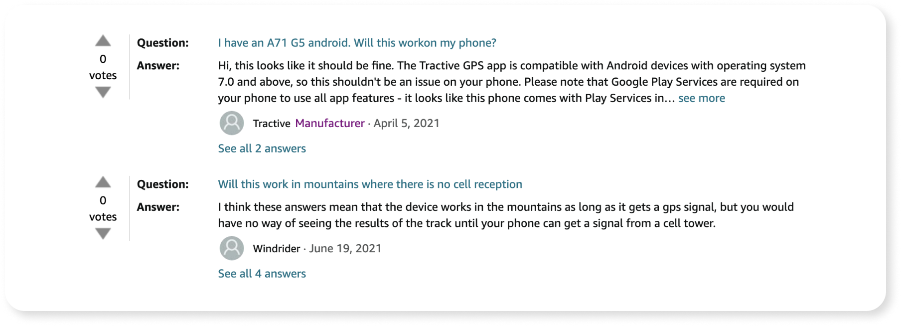
The overarching theme of customer questions was: will this device work for me? This fell under two areas:
Location (many customers from across the world asked whether it would work in their country, and many within the US were curious about whether it would operate well in rural or densely wooded areas)
Network / device (“I use Verizon; is that compatible with Tractive?”). This revealed a gap in understanding around the way Tractive’s technology works: the device is not tied to a specific cell provider, but pulls signal from local cell towers based on whichever network is strongest.
I also had access to another important resource — our database of existing Amazon customers. In addition to increasing conversion, well-crafted A+ content should lead to better reviews and lower return rates by aligning customer expectations with the reality of product capabilities. Based on our market research, my questions audit, and content that our competitors were highlighting, I generated 7 options for content widgets. I then sent out a survey to our recent Amazon customers to ask them about their product search and have them evaluate how useful each content widget would have been in helping them make their purchase decision.
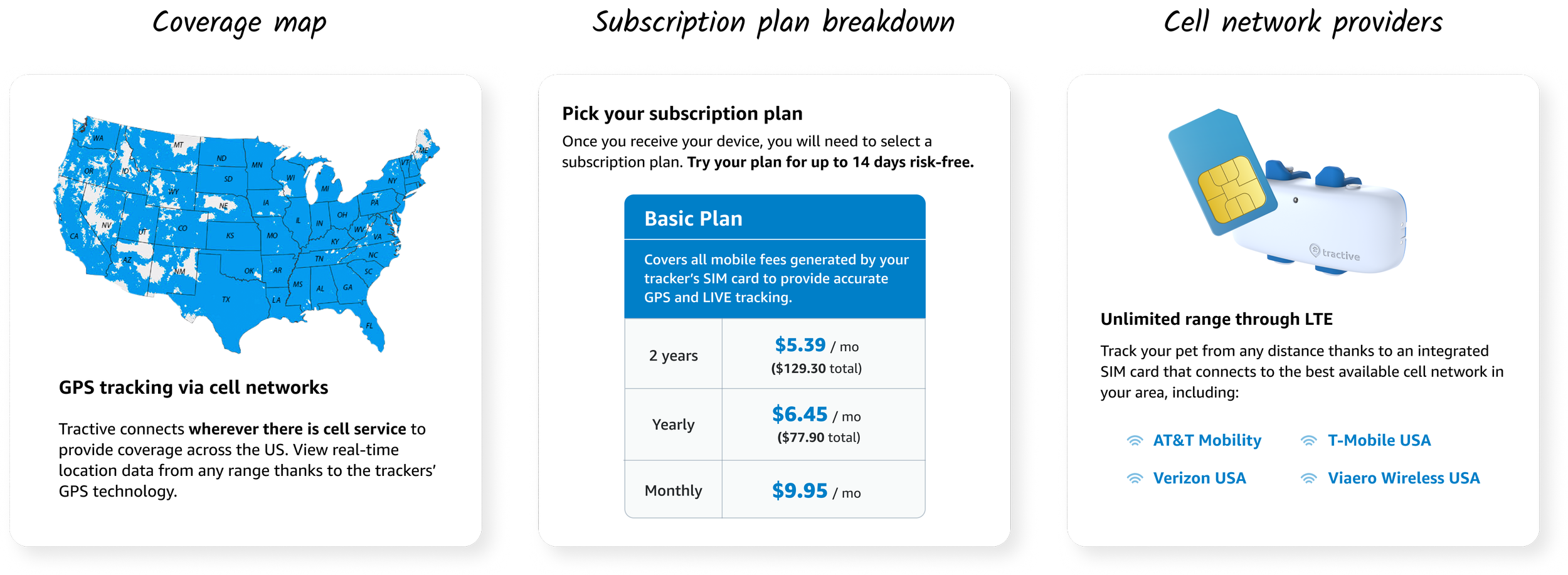
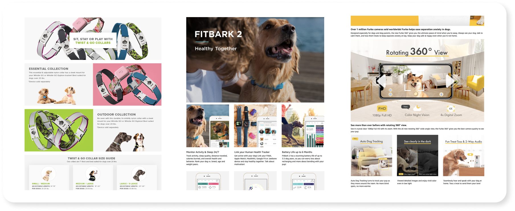
Three widgets were overwhelmingly indicated to have the most value: a cell coverage map, a list of cell providers compatible with Tractive, and a breakdown of the Tractive subscription plan. Another important finding was that many customers looking for a device were shopping around — the majority of customers had compared our device to at least one of our competitors during their search.
Initial iteration
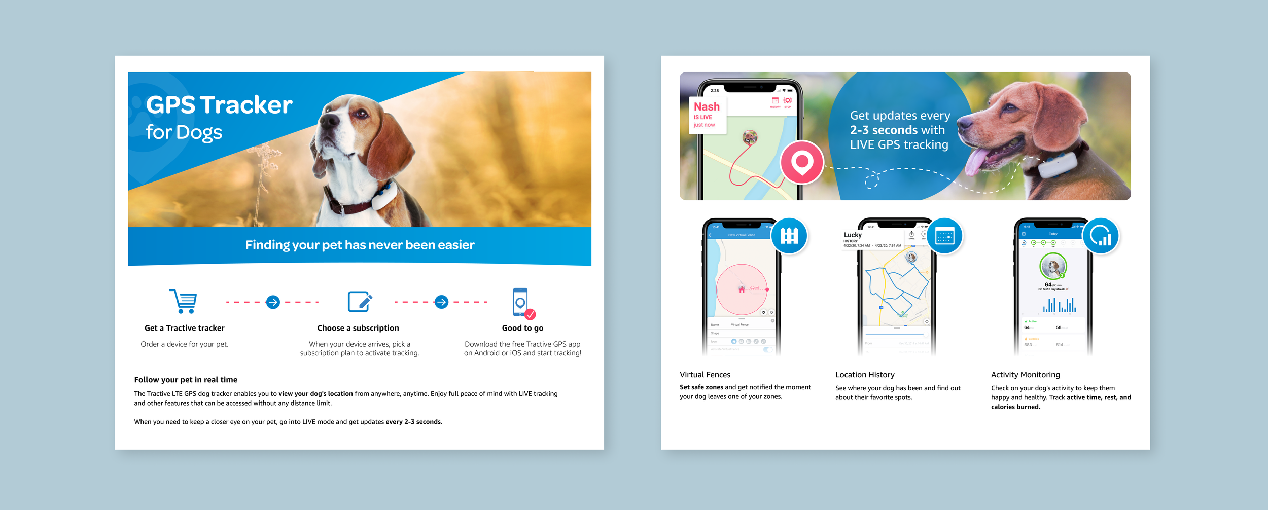
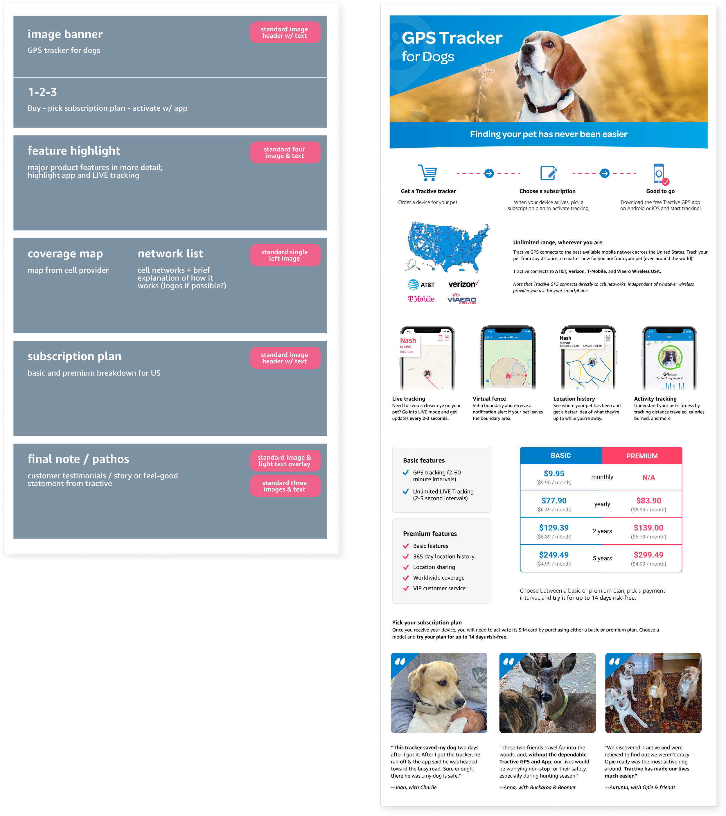
Based on the results from this early concept test, I crafted an initial version of the A+ content that highlighted key product features alongside information about coverage, range, network providers, and subscription fees. Early on, I made a call to use Amazon’s widget templates rather than solely relying on image-based content — a non-negligible portion of our customers made their purchase from a mobile device, and images would be unreadable on mobile screen dimensions, as well as completely inaccessible to screen readers.
This did, however, bring some constraints. Amazon had a limited amount of widget templates available, and these templates were rigid — I had no control over typeface, image size, spacing, or height. I created Figma templates of the various widgets I had at my disposal in order to plug and play, determine which widgets would best accommodate the information I wanted to display, and arrange content so that it felt cohesive rather than a patchwork of individual content blocks.
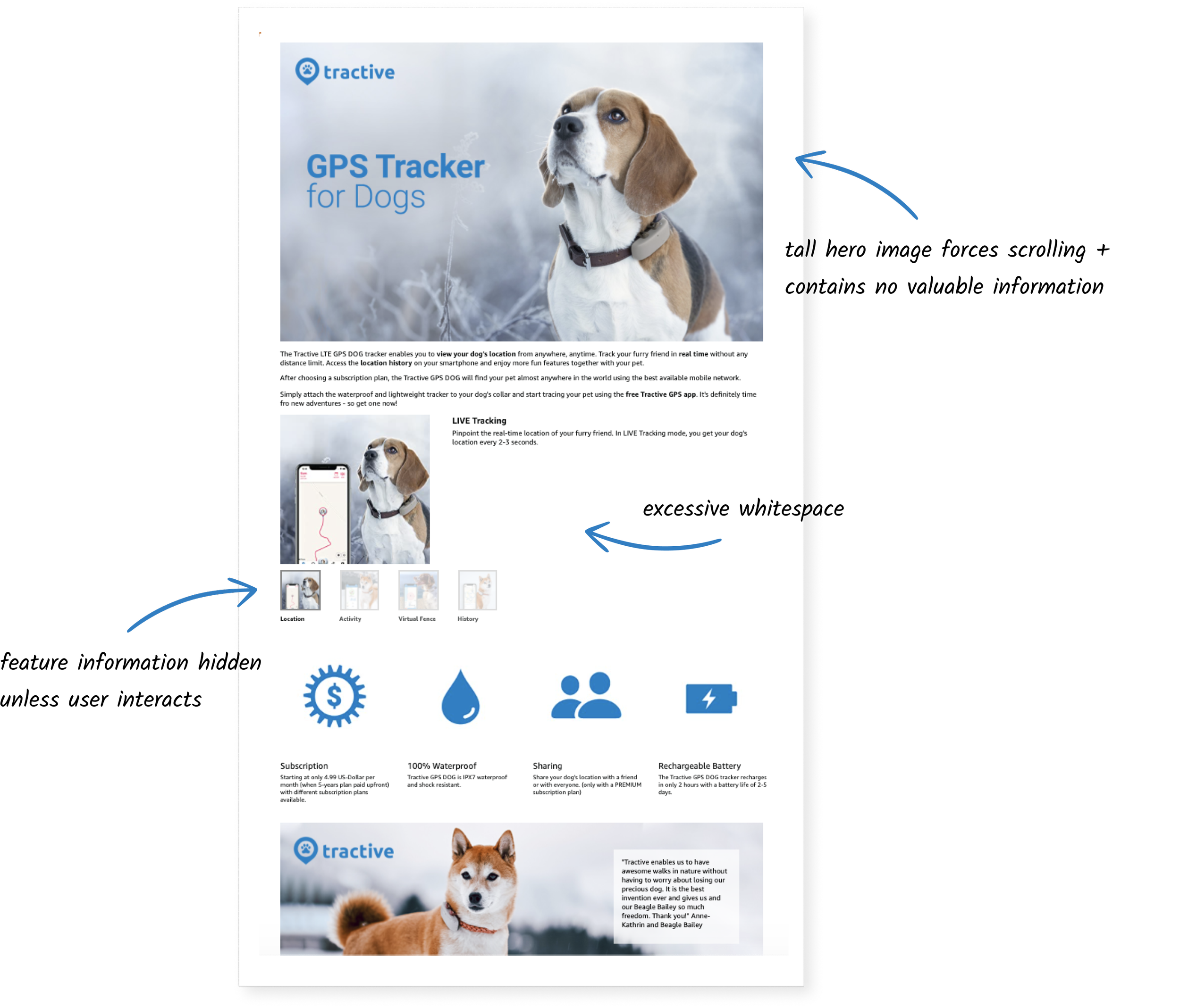
I leveraged the rudimentary experimentation features on Amazon’s seller platform to set up an A/B test comparing the existing A+ content against my new draft. Weeks passed, and I began a daily ritual of refreshing the testing page and waiting to see when enough data would be collected to show results. Finally, metrics rolled in — and the results were negative.
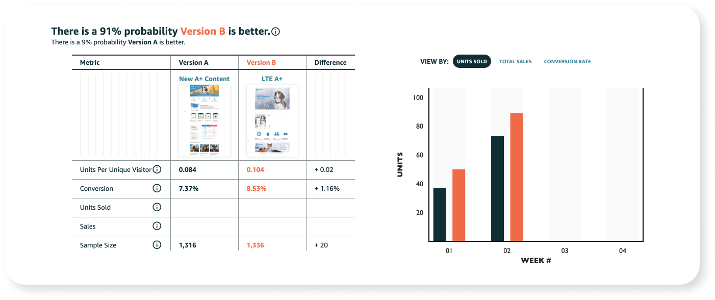
What went wrong? After all, the existing content was essentially a repeat of the Amazon product details with a few extra images thrown in — if the content I had designed was underperforming relative to that, something was off. I took a hard look at the differences between the two treatments, and after conferring with my manager, I formed a clear hypothesis.
The original content barely mentioned Tractive’s subscription plan, while the new content called it out explicitly and shared a diagram breakdown of plan costs. This had been an intentional decision — our past customers indicated that they wished they had known more about the subscription plan, and the existence of the subscription was a clear source of confusion both in negative reviews and in customer questions. However, Tractive had two pricing tiers for its subscription model — basic and premium — and although the basic plan would be sufficient for most customers, the upfront differences between the two were unclear. We also knew that the lower price point of Tractive was often a deciding factor in why customers chose us over competitors — so the prominence of the higher Premium rates likely also led to confusion and dropoff.
Iterating again
Based on our hypothesis, we had a few different paths: we could try to make improvements to the way that we displayed our subscription model, or we could remove that content entirely. Ultimately, I chose to replace the widget altogether. Amazon’s testing limitations meant that we could only test one variant at a time and that we would need to wait weeks to get any signal on data — weeks that would block us from moving forward. We needed to make a bigger bet to confirm or reject our more general diagnosis that the subscription plan diagram was the main source of the conversion loss we had seen.
I refined visuals and replaced the subscription widget with a widget highlighting the app interface and features — while information about the existence of the subscription was still available in both the product images, product details, and the header of the A+ content, I placed less focus on the Premium subscription option. Round two — I launched the test for this updated content and began the waiting game all over again.
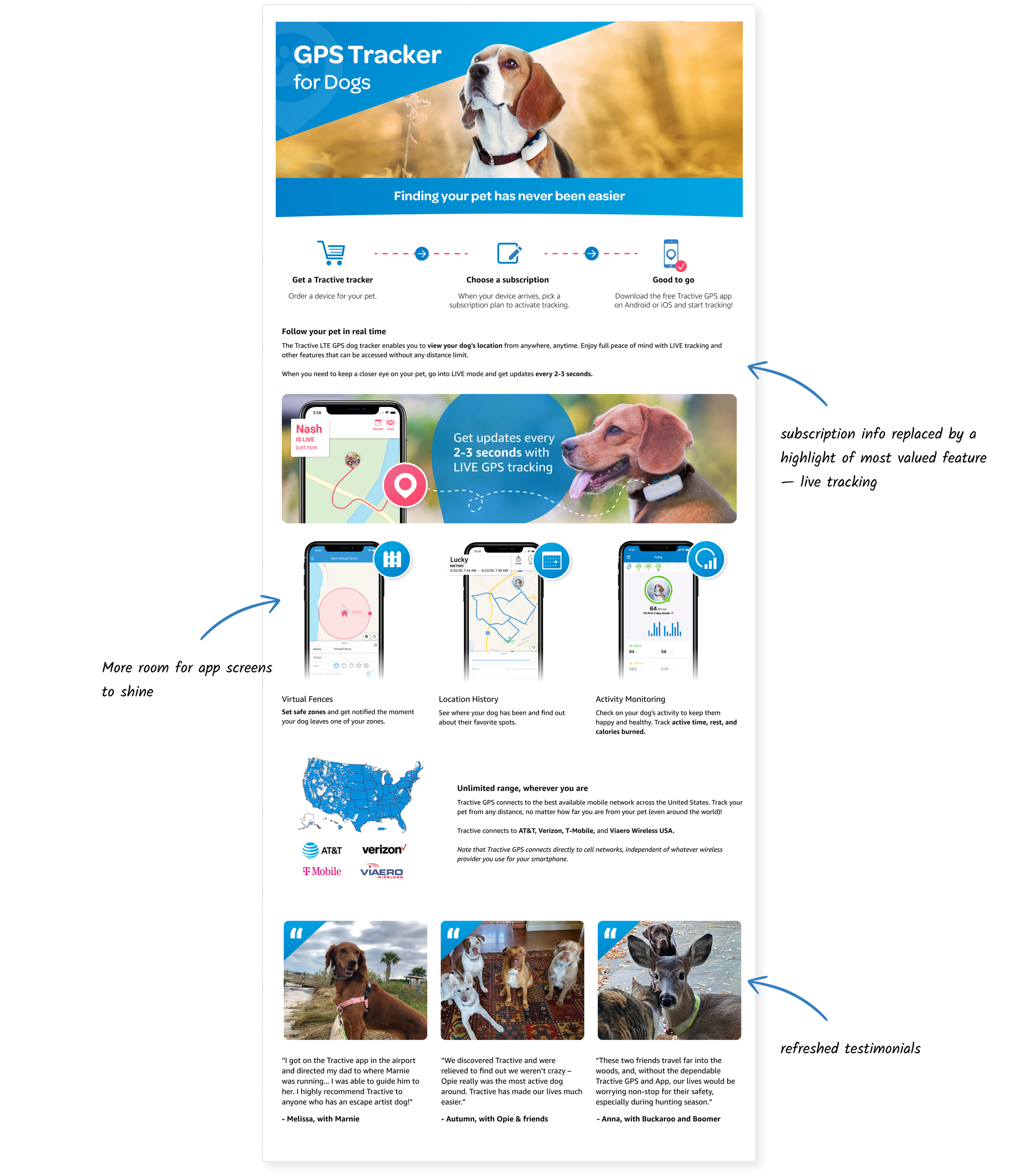
Finally, results came in — and my hypothesis was confirmed. This time around, the content was overwhelmingly successful compared to the control. I published the new content. The updated design has since led to +16% conversion and +$3 million annual sales impact. Tractive has also since restructured its subscription model presentation, streamlining the diagram to focus on the Basic plan.
My time working on Tractive’s A+ content taught me lessons that have since proved extremely useful in experimentation-heavy organizations. I’ve learned how to manage the disappointment from failed experiments in a productive way — it will always be discouraging to see a design that you thought was backed by research flop. Now, though, I understand the importance of taking a moment to feel the initial disappointment and then moving forward to develop logical hypotheses around the problem, iterate on a strong follow-up, and retest.